VAP


Single Page

We took the multi-page website and reduced the complexity with a single page website. With the increase in popularity of smartphones and tablets, users have become very accustom to longer scrolling on the web.

VAP Header


Clean and Responsive

The content was split into a clean and readable sections. With a litte bit of responsive magic, we also optimized it work on tablets and smartphones.

VAP Content

TASA Career Center


Radio buttons galore

The TASA Career Center has a rich database of job openings and needed a lot of filters to allow people to find what they wanted. The problem with the old version of the career finder was that there were so many options that page ended up looking like an overwhelming, endless wall of radio buttons. We couldn’t remove options so we needed to organize them instead. We took the filters and divided them into tabbed section in order to be less overwhelming to the end-user.

tasa-tabs


Able to grow

Of of the key parts of building the frontend is that the backend data could change or grow at any point. The interface needed to flexible enough to handle an unspecified number of additional options. With the tabbed interface and the active filters, we were able to allow the filters to grow limitlessly. But incorporating the active filters allowed the user to still have a grasp of what filters were currently in use.

tasa-filters

Jack Graham


Mobile Navigation

As with any mobile project, a big concern was how to handle the navigation on a smaller screen. We wanted users to get straight to the content when they load the site, so we tucked the navigation into a dropdown to get it out of the way, yet readily accessible. Animate »

menu


Retina Ready

The existing icons on the site looked pretty bad in our retina testing. We replaced all of the icons with an icon font so that they rendered really sharp on higher resolution screens.

Retina Icons

Living on the Edge


Complicated Interactions

They had several complicated interactions like tabbed boxes and pop-up audio players, but they all had to be easy to use in this responsive retrofit. By hiding menus into dropdowns and streamlining the interfaces, we were able to take this complicated user experience and make it easy enough to navigate on a 3-inch screen. Animate »


Annual Report

They already had their traditional print-version of the annual report when we suggested an online version. After a few tweaks and deconstructing the print design files, we were able to start a new tradition with an online version of the annual report.

annualreport

Door Church


A consistent experience

We wanted a user to be able to use the site no matter what device they were on which is why we used responsive design to adapt based on the screen size. Most first-time users come to a church website to find out service times and location so that was front and center.

tdc


Easy to use backend

The Door Church staff is relatively small and none know HTML or CSS and they needed just about anybody to be able to login and make changes to the website. With some custom WordPress fields we were able to make it very simple to change almost anything on the site.
backend


Wait…this is WordPress?

This goes way beyond your typical WordPress installation with a sermon library, staff listing and event calendar custom built into WordPress. Everything was customized specifically to their needs instead of patched together with a bunch of plugins.

wordpress

Sophista


Built on Shopify

Shopify is one of the leading ecommerce platforms, but to get the custom look of Sophista we created a brand new template especially for them. However we were still able to take advantage of all the power of the Shopify backend.

sophista1


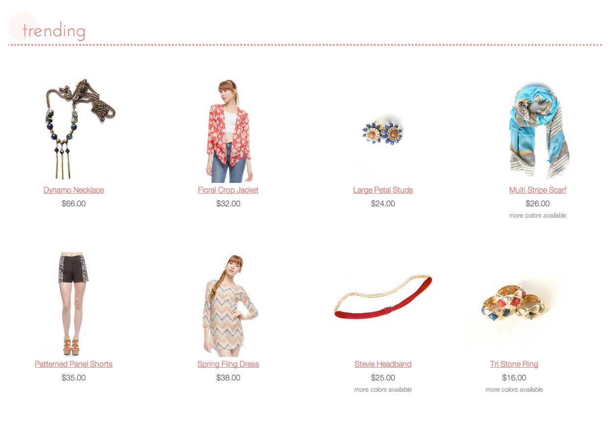
Customizable, but No Code

The Sophista ladies couldn’t (and shouldn’t have to) get into the code to make changes, but they still wanted to be able to customize as much as possible. We developed several customizable areas as well as drove the navigation and structure of the site from the product catalog. This gave them complete control over the site without having to worry about HTML and CSS.
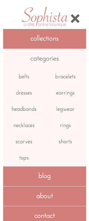

Mobile

As with all our solutions, there was a ton of thought and time put into how the site works on smartphones and tablets. Everything from checking out to creating accounts is all optimized for a user no matter what device they may be on.

sophista2