Living on the Edge


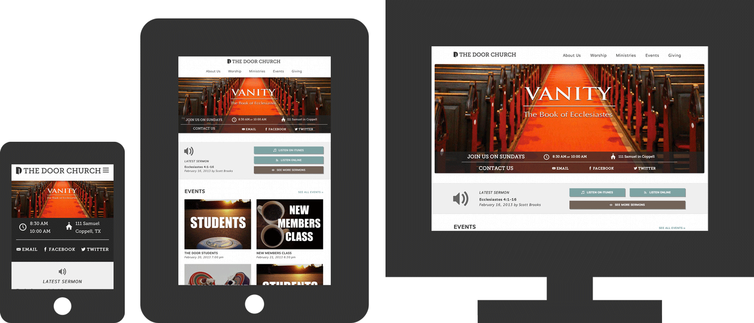
Complicated Interactions

They had several complicated interactions like tabbed boxes and pop-up audio players, but they all had to be easy to use in this responsive retrofit. By hiding menus into dropdowns and streamlining the interfaces, we were able to take this complicated user experience and make it easy enough to navigate on a 3-inch screen. Animate »


Annual Report

They already had their traditional print-version of the annual report when we suggested an online version. After a few tweaks and deconstructing the print design files, we were able to start a new tradition with an online version of the annual report.

annualreport

Door Church


A consistent experience

We wanted a user to be able to use the site no matter what device they were on which is why we used responsive design to adapt based on the screen size. Most first-time users come to a church website to find out service times and location so that was front and center.

tdc


Easy to use backend

The Door Church staff is relatively small and none know HTML or CSS and they needed just about anybody to be able to login and make changes to the website. With some custom WordPress fields we were able to make it very simple to change almost anything on the site.
backend


Wait…this is WordPress?

This goes way beyond your typical WordPress installation with a sermon library, staff listing and event calendar custom built into WordPress. Everything was customized specifically to their needs instead of patched together with a bunch of plugins.

wordpress

Sophista


Built on Shopify

Shopify is one of the leading ecommerce platforms, but to get the custom look of Sophista we created a brand new template especially for them. However we were still able to take advantage of all the power of the Shopify backend.

sophista1


Customizable, but No Code

The Sophista ladies couldn’t (and shouldn’t have to) get into the code to make changes, but they still wanted to be able to customize as much as possible. We developed several customizable areas as well as drove the navigation and structure of the site from the product catalog. This gave them complete control over the site without having to worry about HTML and CSS.


Mobile

As with all our solutions, there was a ton of thought and time put into how the site works on smartphones and tablets. Everything from checking out to creating accounts is all optimized for a user no matter what device they may be on.

sophista2